10 Great Examples of Conference Website Designs
Get Ready to be inspired for your conference website
A Conference website is a must for multiple reasons.
Of course, sharing dates, location, keynote speakers, contact information is essential. But your conference website will also be a powerful weapon to address common challenges like:
- Attracting sponsors;
- Building credibility;
- Encouraging participants to travel in post-pandemic times;
- Increasing registration or submissions.
If you’re thinking: "Yes I agree, but I'm not a web designer or a marketing strategist! And I need to get this done in between writing grants, reviewing papers, or managing a lab.”, I’ve been there.
Our goal with this article is to show you how to tackle these challenges conference organizers face using good conference website design examples.
One thing that strikes me is the lack of beautiful conference websites for research conferences. For this reason, you’ll find below conference website examples in all domains.
Before we start, if you’re a PI, don’t hesitate to delegate this to a graduate student in your lab! That’s how I got involved in organizing my first international conference (and how Fourwaves was born).
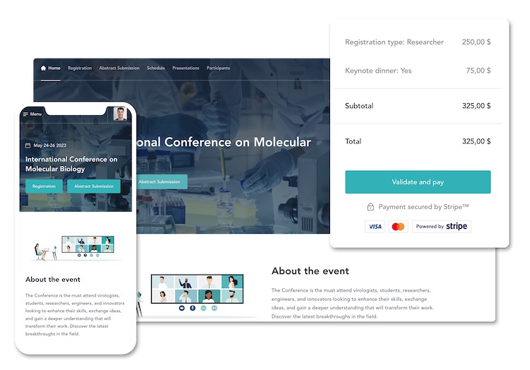
You can also use a conference management tool, like Fourwaves, that comes with a free conference website (complete with registration and payment management, a web app, event schedule, even an abstract management system) that you can easily customize for your very own event in a matter of minutes.

Fourwaves conference website
You can try Fourwaves for free so don't hesitate to give it a go, or book a demo to see if it would fit your needs.
Without further ado, here are our 10 examples of best event website designs.
10 best conference website designs examples
Clear call to actions, great color schemes, well though-out headers and white spaces; here are some conference website design examples and why we like them.
1. Transatlantic ECI GPCR Symposium
This 1-day event is organized for Early Career Investigators to promote collegiality and collaboration among early-career scientists in the GPCR field.
What we like about this website: it’s straightforward and effective.
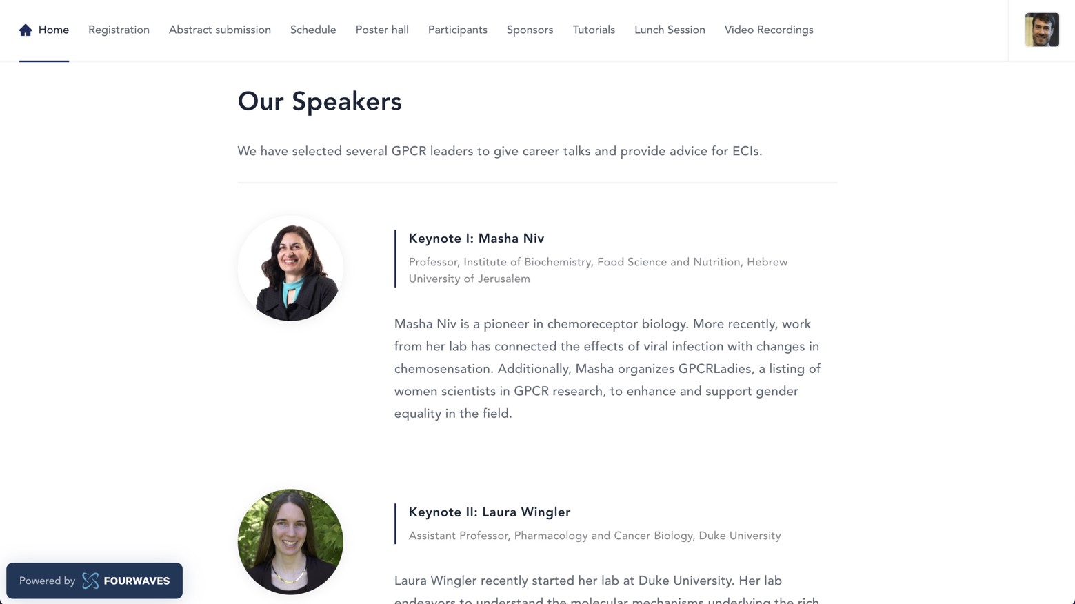
This scientific conference website has a simple structure and is easy to navigate. The top menu remains visible as you scroll allowing you to jump easily from one page to another. Also, the registration button stands out with a darker blue color guiding the participants to this important page easily.
The key information is organized into distinct content blocks. For example, the speakers are shown with a headshot and a small bio one below the other.

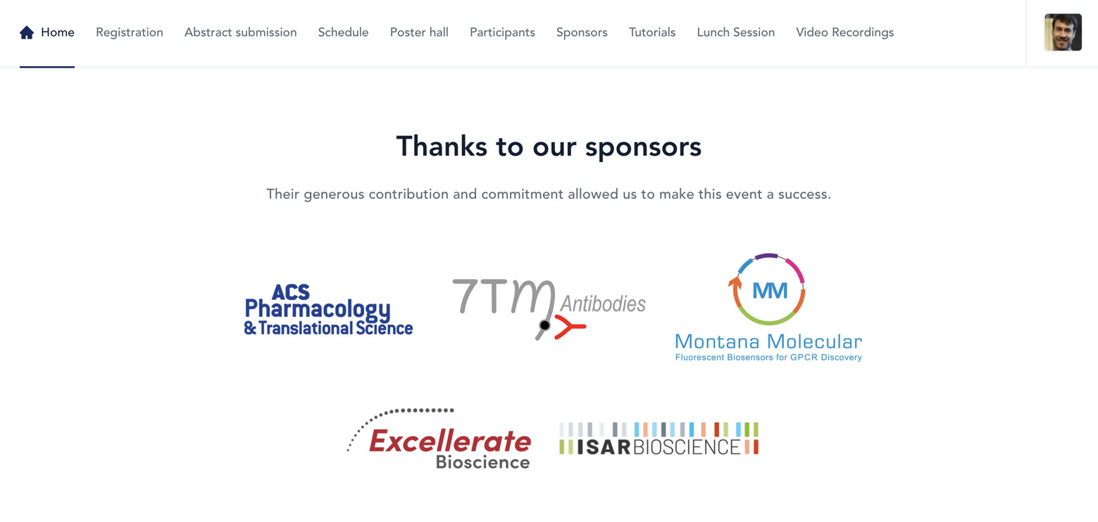
The contributing sponsors are displayed with colored logos that add a nice visual touch.

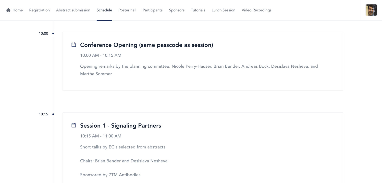
The event schedule is also presented with no distractions. The timeline on the left side shows what time each session happens.

Last but not least, the whole website is fully responsive, which means it can be viewed on mobile devices or tablets.
Even better yet, it was made using Fourwaves, so if you like this website design, give it a try.
2. London UX Fest
The event is an online celebration of digital design and user experience. The talks are on user research and product strategy and more.
What we like about this website: the transitions and animations.
The conference website has the information presented in a captivating way and the pages are full of movements. This is expected as the event is about user interaction and interface/product design.
The event website is composed of many micro-interactions, which is a term used in the interface design field to identify certain types of visual effects. Their role is to provide feedback to the user and more generally to delight them.

For example, when hovering the mouse on the ‘Tickets’ button, there is a “splash” of small icons that slowly disappear. This rewards the visitors and incites them to interact even more with the site and likely increases ticket sales.
It is important to use the level of animations and visual effects that correspond to the vibe you want to project for your event. For a scientific conference website, you might not need all the bells and whistles, but you’ll want to highlight important call-to-action (CTA) buttons. For example, make the button for call-for-abstracts or registration visible by using a contrasting color.

3. Inbound 2022
Inbound is the main annual event of the CRM Hubspot.
What we like about this website: the design of the site is in tune with the brand design.
If you know Hubspot, you will get why the event website is in tune with the brand. From the color palette and fonts to the layout and shapes, everything in this website reminds us of the Hubspot product.
If your conference is being hosted by a well-known organization, use their existing branding elements on your event website. Color scheme, fonts, typography, button radius, and shapes are easy to implement and give a coherent look and feel.
It may not seem like it at first, but the resulting impact is strong: it gives a sense of familiarity with a known organization. This increases credibility, confidence, and most likely the interest around your event.
The video that appears prominently above the fold is also a great way to increase engagement on the event page.

4. Emberconf
Emberconf is dedicated to Ember.js, an open-source web framework.
What we like about this website: it is completely unique and different from what we usually see.
The colorful graphic design, the icons, the font, and the retro style all add to the feeling that this conference is singular. It conveys a fun and dynamic atmosphere.

A different design style like the Emberconf website will work best if your conference is in the gaming or technology industry. If your event is related to something more “serious” like healthcare, a more traditional web page template will work best.
If that’s what you’re after, a dark background with bright text will contribute to a futuristic look.

5. Red Hat Summit
The Red Hat Summit talks about open-source innovations and insights in enterprise IT.
What we like about this website: it has an elegant and clean design.
Great conference websites that are easy to navigate and look professional are rare. On this one, it seems every component was meticulously adjusted and that every visual detail on the landing page was addressed to fit together.
There is also a nice chatbot at the bottom to answer questions and give event details.

6. Full Stack Fest
This example is a bit different. It is not a conference website per se, but a repository of past editions of the Fullstack Fest, an event for web developers.
What we like about this website: it builds credibility.
This is an important aspect to communicate as many new conferences are emerging and “competing” for participants.
By showing past editions of the event, it inspires credibility. It also highlights the “evolution” of the conferences over the years and how it reinvents itself to stay relevant. You can see the logos and themes and when you click on a specific edition, it firmly revolves around the style for that year.
If you’re only doing your 2nd or 3rd edition, don’t worry. There are other ways you can build credibility. For example, you can:
- Highlight top speakers you invited in past editions (like Nobel Laureates, Pharma company CEOs, or government representatives).
- Share key numbers like the total number of participants, the number of countries of your participants, visible minorities reached.
- Mention who the spokesperson is. Sometimes, smaller events can easily find someone in their field that supports the conference’s mission.
- Provide testimonials from participants of past editions.
This website also highlights another lesson. It shows that you do not have to stick to a specific style throughout the years. Changing it from one year to another can help reflect the evolution of the conference.

7. Take Control
The event aims to provide insights on how the accounting and finance roles are changing and how processes can become more automated, accurate, and collaborative.
What we like about this website: The information is presented seamlessly on one single page.
A simple one-page layout can save you time since you do not need to create and maintain multiple pages. Having organized many conferences, I know that any tips to save time are valuable.
In this case, the top menu is always visible when scrolling down which means visitors can easily navigate to the section where the information of interest is located.
Also, having everything on one page means the page doesn’t reload at every click, giving a fast and smooth experience.

8. The Martech Summit
This event merges two topics: marketing and technology.
What we like about this website: the emphasis on networking opportunities. More precisely, how they skillfully highlight the key differentiator of their event.
At first, this one didn't seem like the best conference website. The choice of colors, the small margin between content blocks aren’t great. But one important thing they got right is communicating their key differentiator in several ways.
- Above the fold, 4 statistics are given about the conference and the first one is the number of hours of networking (12 hours). Keep in mind that it’s a 2-day event.

- When highlighting past speakers, the emphasis is on the well-known companies they work for, suggesting that this is the kind of person you’ll network with.

- A section more towards the bottom highlights clearly how the conference maximizes networking opportunities.

The underlying strategy is clearly the promotion of the strong networking aspect of the event. Maybe the tight margins and the compact design were deliberately chosen to match the closeness one can feel at their networking event!
9. AdWorld Conference
The AdWorld Conference is a global conference on advertising.
What we like about this website: how they highlight advantages for exhibitors.
Attracting sponsors and exhibitors is a challenge many organizers have in the virtual realm. They are an important source of revenue and they want to know what’s in it for them, especially at a virtual conference.
AdWorld communicates this clearly with the anatomy of the booth listing and the booth page. They show the key elements of the interface clearly showing the experience.

If you can highlight those benefits for your sponsors and exhibitors, add a visual element to really let them know what it will look like on the day of the event.
There are 3 other things worth mentioning.
First, the clear call-to-action buttons stand out to help convert visitors. You want them visible so participants accomplish your main goal.
Second, this is a great example of a conference website that works well with multiple colors to catch the eye. If you scroll down the home page, a dozen different vibrant colors identify each track and definitely catch the eye. There’s even a countdown to their latest promo on the bottom of the page.
Third, I really love the speakers' photos, with a cosmic-like background. It feels like they're coming from another dimension to share their god-like knowledge!

10. DevIt Conference
DEVit is the leading web developer conference in Southeast Europe.
What we like about this website: how they use the site to provide post-conference updates.
It is a missed opportunity for organizers to create an event website and forget about it after the event.
You should consider your website as an extra channel to:
- Thank the people who were able to attend.
- Share testimonials.
- Talk about upcoming conferences, meet-ups, or seminars.
- Highlight results, or any other relevant information about your past event.
- Upload video recordings and related materials that participants can take home.

Conclusion
When I talk to event planners, I ask them one fundamental question: What are the objectives of your event? Everything, from your social media posts to your conference website design, should revolve around the answer to this question.
In addition, the common key functions of a conference website are:
- Sharing important event information, including registration and submission deadlines.
- Mentioning how participants can communicate with organizers.
- Providing travel information.
- Highlighting sponsor contributions.
- Sharing the event's schedule.
- Sharing post-event information and documents.
Building an effective conference website is hard. Especially with virtual events, participants expect the best user experience. This used to be true only for design conferences, but now the ugly scientific conference websites from the past just won’t cut it anymore. It needs to be user-friendly, beautiful and informational.
Nowadays with the help of website templates and website builder tools, such as Fourwaves, you can easily bring your event website to life and include everything from registrations, abstract submissions, the schedule, a helpful FAQ, and even tools for virtual conferences.
Event management doesn’t have to be a hassle, with the right event website, your target audience should be able to easily understand what the event is about, buy tickets, and enjoy a great event.


