How to Make a Successful Scientific Poster
Good science goes nowhere if it’s not communicated well.
Poster sessions at scientific conferences are a hub for knowledge dissemination and research networking. So, knowing how to design a good conference poster is a big part of becoming a successful scientific communicator and sharing your work with a larger community.
Making a scientific poster can be an exciting and rewarding experience. A well-designed poster can help you showcase your research to attract the attention of fellow scientists and potential collaborators or sponsors.
So, to help you get started, this scientific poster guide covers all the bases. From a step-by-step poster creation process to useful examples and templates, you’ll find everything you need here to put together a successful scientific poster.
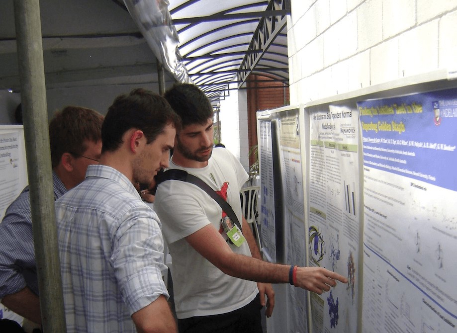
Students discussing during a scientific poster session.
What is a scientific poster?
A scientific poster is a visual representation of research or scientific work presented at a conference or other professional gathering. The goal is to present complex research information in a way that is easy to understand and visually engaging for conference attendees. You want to concisely tell the story behind your science, all while making it accessible to non-expert audiences.
Scientific posters can include text, figures, tables, graphs, infographics, charts, and images to convey the key findings of a research project (these elements may also be used to highlight the significance or implications of the research). A scientific poster typically consists of a large, printed sheet of paper or fabric, on which the presenter displays the results of their research in a clear, concise, and visually appealing manner. If you’re presenting at a virtual poster session, your “poster” might be a digital file, a presentation, or a recorded video.
During a conference poster session, a researcher usually stands by their poster display while other conference participants wander through the room, viewing presentations and interacting with various authors as they go.
What is a good size for a scientific poster?
The ideal size for a scientific poster will vary depending on your conference or event requirements. However, the most common size is 48 inches (122 cm) wide by 36 inches (91 cm) tall. This size allows for easy transportation and can fit on most poster boards or display areas.
Regardless of the common size given here, it's still important that you check the specific requirements of the event where you will be presenting, as they may have different size limitations or guidelines (the event or conference website is usually a good place to find this information). Resizing a finished poster can be a real pain. So, it’s best to check the conference requirements first thing so you can start your poster off on the right track.
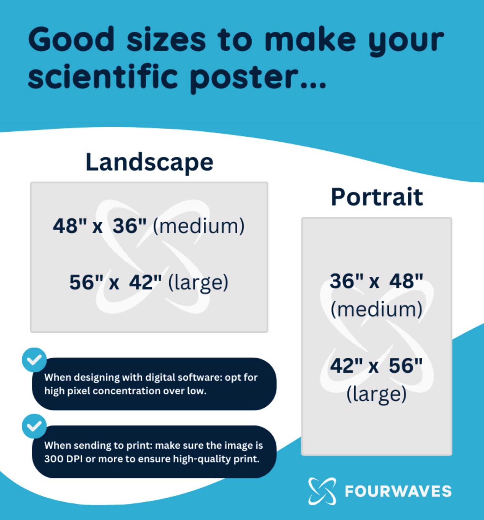
One important thing to keep in mind when designing your academic poster with any digital software: It’s better to start bigger (when it comes to pixels). Also, make sure to send a high DPI image (eg. 300 DPI) for printing to ensure a high quality print.
What is the best software to make a scientific poster?
Microsoft PowerPoint and Google Slides are two of the most common and easy-to-use programs for making scientific posters. Adobe Illustrator is sometimes used by individuals with more advanced design skills. The best software to make an effective poster will depend on your personal preference and/or familiarity with the tools available.
Here’s a handful of popular software options for making scientific posters (and their benefits):
Microsoft PowerPoint: PowerPoint is a widely used software for creating presentations, and it can also be used to create scientific posters (by designing an entire poster on a single presentation slide). It also offers a variety of design templates and tools to create visually appealing posters. Many university computers give students and staff access to the Microsoft suite of tools, so this can be a good free option.
Google Slides: Similar to PowerPoint, Google Slides is a popular software for creating presentations (with the added ability to create scientific posters). It’s free to use which makes it one of the preferred options for early-career researchers.
Adobe Illustrator: Illustrator is a vector-based design software that is ideal for creating high-quality graphics and images. It offers advanced features for typography, color management, and image editing. However, using any Adobe software often comes with a hefty subscription price (and a steep learning curve if you’re unfamiliar with the tools).
Canva: Canva is a web-based graphic design platform that offers a variety of templates and tools for creating posters and other visual media. It is user-friendly and requires no design experience. You can get a free personal account (or pay for upgraded features).
LaTeX: LaTeX is a document preparation system that is often used for scientific publications and presentations. It offers advanced features for typesetting equations and mathematical symbols.
Mac Pages: I made 3 posters during my PhD using Mac Pages. I found it quite easy to work with to add text boxes and colored sections. It’s very similar to PowerPoint in many ways. This is an excellent option for Mac users since it’s free.
InkScape: InkScape is a great tool for students on a budget (it’s free). It offers a simple and efficient way to create vector designs or scientific illustrations.

If you’re attending a virtual conference, you may have additional options for creating a virtual scientific poster. In this case, recording on Zoom, adding audio to a slideshow on PowerPoint, or recording on Quicktime are all good options to consider. Check out our article on guidelines for a virtual poster presentation for more advice.
How to make a good scientific poster for a conference
A well-designed and informative poster that effectively communicates the key findings of your research is your primary goal.
You’ll want to make sure you tailor your poster to the context you’ll be presenting in (i.e. the size of the space, your presentation format, and the level of knowledge your audience is likely to have about your research topic). You’ll also want to give yourself enough time to finish your poster (anywhere between 5 days to a few weeks depending on how much experience you have).
Before we dive into the details of the scientific poster creation process, here’s a highlight of what makes a great scientific poster (and common mistakes to avoid):
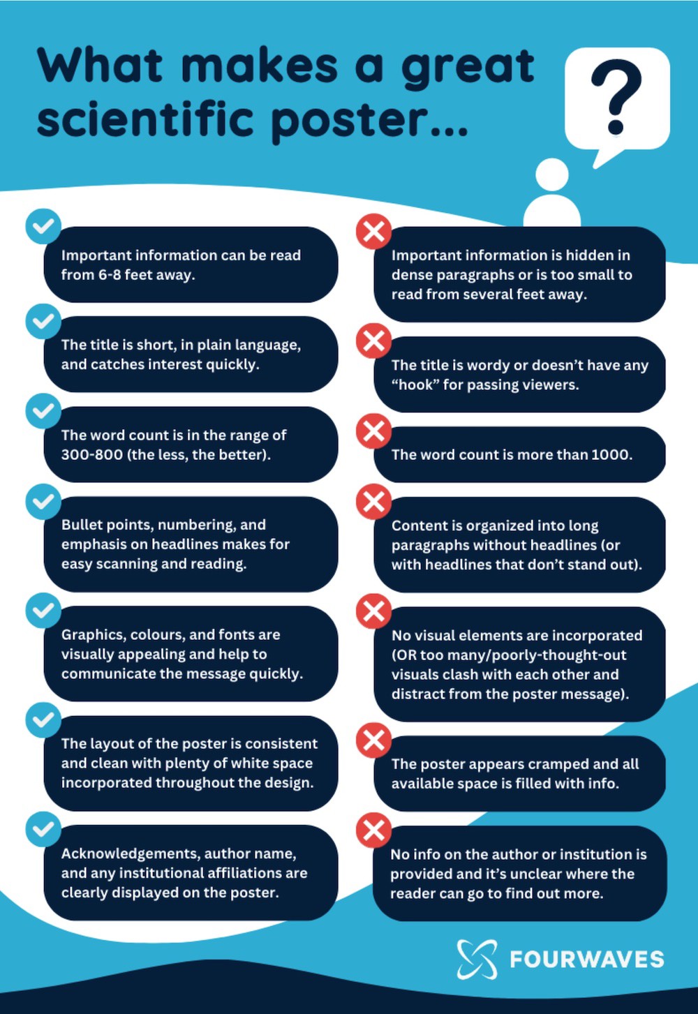
So, keeping the above highlights in mind, here’s our step-by-step guide to help you make a scientific poster that will stand out at any conference:
1) Decide on the poster narrative and key messages
Before you begin designing your poster, plan the core content. Start by considering the purpose of your poster and the key message that you want to convey. Identify the main findings of your research and the most important conclusions that you want your audience to take away from your poster. Keep these messages in mind and then think of the varied ways you could weave them into a connected narrative (both visually and verbally) when presenting your poster. This is a great exercise to help you get better at storytelling in science in general.
Later on, when you design your poster and format it, these key messages will need to visually stand out so that someone walking by or scanning your poster can pick them up without stopping to read the full thing.
2) Decide on the sections of your scientific poster
Once you’ve determined your key message(s), you’ll need to organize your research content into sections that make logical sense. Like the abstract in a scientific paper, your poster should have sections summarizing the background and rationale, methodology, results, and the implications of your work. Some common sections included in a scientific poster include:
Title, Key Finding or Takeaway - Highlight the core message in a catchy way.
Introduction - Provide background information and a clear research question or hypothesis. Introduce only what’s necessary to address any knowledge gap.
Methods - Explain the methodology used in your research. This is often the easiest section to skip (or merge with the results to save space and tell your story better).
Results - Present the key findings of your research in a visually appealing way in the results section. Use graphs and tables with legends and titles.
Discussion - Interpret and discuss the implications of your findings.
Conclusion - Summarize your research and its significance. Comment on possible future research. This section can easily be combined with the discussion section.
Citations & Acknowledgements - Reference important materials, your institutional affiliation and thank individuals for specific contributions to your research. This can be smaller than other text so as not to distract from the core message, but it should be included somewhere.
Prompt to Find Out More - Give interested readers an easy option to dive further into your research. Include a resource link (or a QR code) to additional materials.
Keep in mind: these are common sections included in a poster, NOT required sections. Feel free to get creative with more descriptive headings or combine sections if it helps you communicate your message better (and in fewer words). And, wherever possible, think of ways to tell your story through figures and illustrations rather than through text. Biorender and the Noun Project are both great resources to help you find and create visuals for your poster.
3) Create your poster layout and structure
Once you have a clear idea of the content that you want to include, create a rough layout of your poster. Decide on the overall structure of your poster and the placement of each section. This is a great time to pull out a sketchbook and a pencil to mess around with a few different ideas. Or, if you prefer a digital drafting process, you can start making your layout in your software of choice right away.
To make the design process easier, you might want to choose a poster template to customize. There are heaps of useful scientific poster templates available online that you can use (this collection is a good starting point). Some universities and research centers even provide poster templates that use a specific color scheme and already include the necessary logos. Check whether your institution has a template like this and consider using it if they do - it will save you a lot of time!
Your poster layout should be well-organized, with each section following clearly from the previous one, creating a visual path that tells a coherent story. Decide what will be the direction that the information flows (i.e. left to right and then down? OR top to bottom and then to the right?). Someone who is looking at your poster should not have to jump from one side to the other in order to understand your work. Consider the use of numbers or arrows to indicate the flow of what comes next. Or get creative with eye-catching visuals that naturally draw the reader's eye through the sections in a logical order.
4) Spruce up your scientific poster with a bit of style
The visual design elements (especially colors and fonts) that you choose for your poster can have a big impact on its effectiveness. When choosing a font, consider both the font type and the font size. Picking to read and size is important to help to structure the poster content.
Choose a color scheme that is visually appealing and easy to read (free generators like Material Palette are handy for this if you don’t have an eye for design). Be sure to use high-contrast colors to make important information stand out and to help visually impaired visitors.
Choose fonts that are easy to read and make sure your chosen font size is readable from a distance. Also, consider using a pattern of varying font sizes and/or types to help visually differentiate between poster title, body text, headings, and poster highlights. Use no more than two or three different fonts in your poster overall to avoid clutter and confusion.
If you’re planning to feature a specific image or illustration in your poster, consider using it for inspiration for your color scheme or fonts. It will ensure that your final poster has a more cohesive and less cluttered look.
5) Put all the pieces of your poster together
If you’re using software like Powerpoint: First, choose your page size. Then, start to create content blocks and insert text where appropriate.
If you’re uploading pictures of any sort to your poster design, be sure to use high-quality, high-resolution images. Only import images with 300 dpi resolution (saved in PNG or TIFF formats) to your poster. Double-check to be sure you’ve uploaded good pictures: a high-quality image should not appear blurry or pixelated at 100% zoom.
Once you have your template and design elements in place, it's time to add your content. Begin with the main sections of your poster, such as the introduction, results, and discussion. Use graphs, charts, tables, and images to present your data in a clear and visually appealing way.
When adding text, use short sentences and bullet points to make it easy to read. Use headings and subheadings to break up the content and make it more visually appealing.
6) Print your scientific poster and get ready to present it
Once your poster is complete, it's time to print it so it’s ready to present at the conference. Again, it’s important that you read the conference guidelines very carefully and print your poster in the correct size and orientation. Make sure you print in the highest-quality as well.
Some institutions have dedicated printing facilities, but you can also visit a copy shop that has a large-format printer. If you haven’t had to get a poster printed before, it’s worth asking a colleague for recommendations on a good local spot. Or, if you are feeling creative, you might want to go a different route and print your poster on fabric (this gives you the option to reuse it as a unique table cloth or picnic blanket in the future).
Whatever your printing format, make sure you budget enough time for a reprint if disaster strikes (a week or more of buffer time is a good bet). It’s also worth testing printing out with a “dummy poster” on a small piece of paper. This will allow you to check that everything looks okay when printed before you spend a good chunk of change on the final, full-sized poster.
Finally, when preparing for the conference, be sure to bring all of the necessary materials with you, such as pins or velcro strips, to hang your poster. It doesn’t hurt to also have a digital copy of your poster on a thumb drive just in case something happens to yours in transit. Many conferences have onsite printing services that you could resort to in the event of a mishap.
A few extra tips to help you make a scientific poster
Just a few more helpful things to keep in mind when designing your scientific poster:
1) Quality over quantity
A little bit of text goes a long way on a poster - in fact, the fewer words the better. Posters with less text are more inviting and easier to absorb. Don’t forget that you will be there to explain your work, so there is no reason to try to include everything in the text. Shorten your text by summarizing sections with bullet points and highlighting the key messages.
As mentioned in this article on designing conference posters: If all of your text is kept to a minimum (500 words), an average person could fully read your poster in about 5 minutes. Think about how long you’d want to spend reading through a poster, and use that as motivation to chop your content down to even less than that 5-minute reading mark.
2) Use color, visuals, and white space strategically
Great posters maintain a good amount of white space around the text boxes and figures. A cramped poster is hard to read (and intimidating to passing attendees looking for catchy, quick takeaways). A safe bet is to always include more white space than you think you’ll need.
As much as graphics and visuals can help, they should only be used if they truly are helpful. Don’t get too wrapped up in “decorating your poster.” Get rid of any images or illustrations that aren’t directly related to your research and that don’t help you highlight the key messages you want to deliver.
Finally, resist the urge to use a blown up photo as your poster background. All it adds is confusion and clutter. You’re better off using a light, neutral tone in the background and adding interest with relevant, informational graphics.
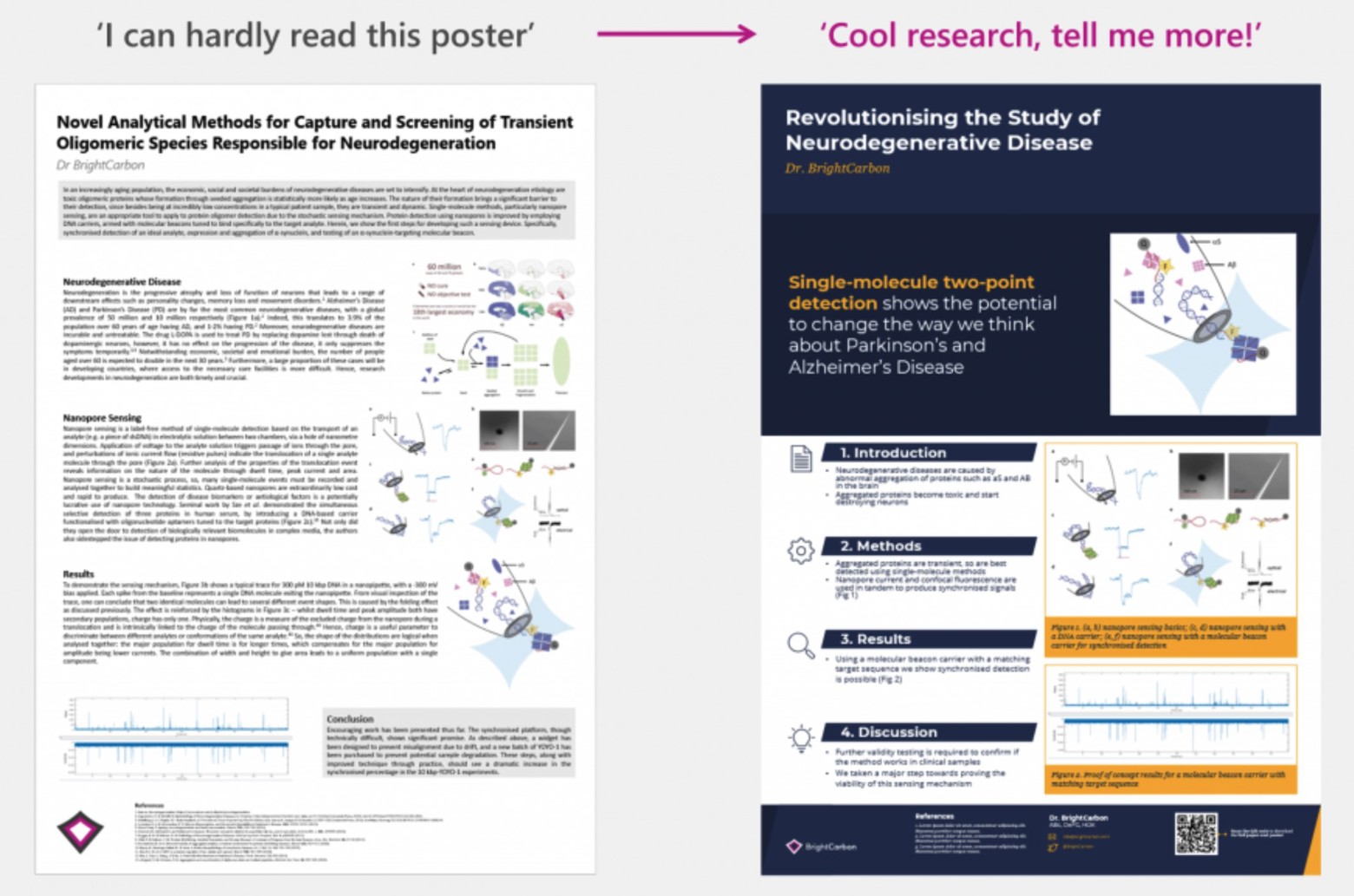
This image from brightcarbon shows how good visuals and spacing can make a poster catchier and better at quickly delivering information. They’ve also got great templates for posters if you’re looking.
3) Get picky about your poster fonts and formatting
After you’ve looked at the big picture design and made sure your key message is coming across clearly, dive into the details to perfect your poster:
- Try to make all of your text boxes the same width. It keeps things visually consistent.
- If possible, keep paragraphs to 1-2 sentences rather than big blocks of text.
- Use italics instead of underlining. Underlining draws too much attention to a word.
- Don't use fancy fonts. They make your poster look busy and can make it harder to read (especially for people with dyslexia). In general, sans serif fonts are easiest to read.
- Except for a few words that you might want to highlight, ensure that all of your text is black or a dark color to create better contrast and readability.
4) Don’t be afraid to get a bit creative
We’ve listed some common poster elements and templates in this article, but that doesn’t mean you should hesitate to be creative. Think about design elements or images that are relevant to your research and that could make your poster stand out from the crowd. A few ideas to get your creative brainstorming started:
- Add hidden informational panels behind paper flaps on your poster to make the experience more interactive.
- Attach objects or physical things to add some dimension/interest to your poster.
- Bring props or handouts to supplement your poster beyond what exists on it.
The same goes for your poster layout. Don’t be afraid to completely switch things up in a way that suits your research. A twitter-famous example of this was Mike Morrisons take on the best conference poster layout:
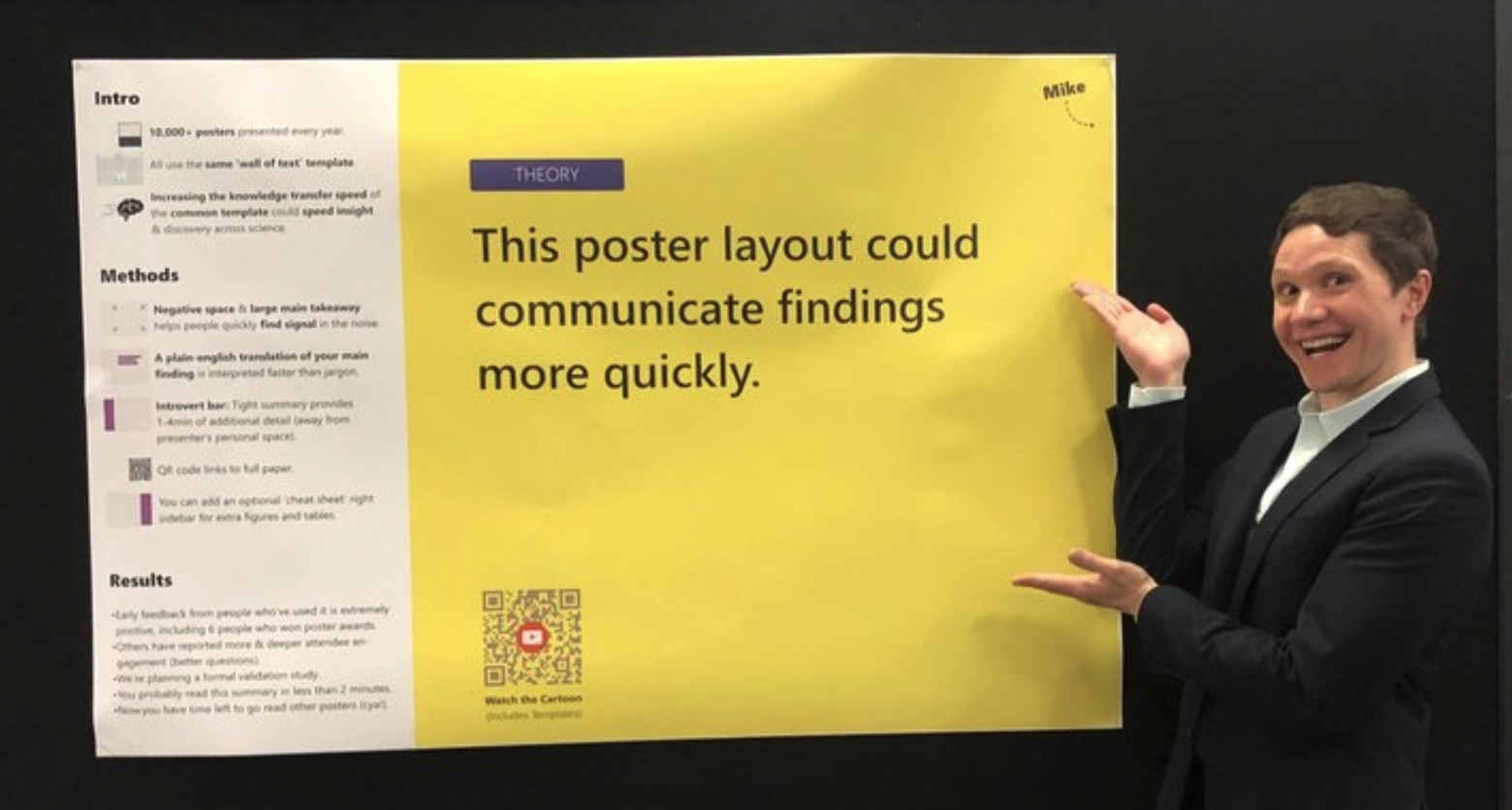
Mike displays his poster layout (Image Source: NPR)
Mike’s innovative take on the research poster template prompted other researchers to think about how to reinvent the wheel. His video on poster sessions captures the need for this kind of creative approach perfectly. A few conferences even adopted it as their required template.
5) Get a second (and third) opinion on your scientific poster
Before you finalize your poster, make sure to review it carefully for accuracy, completeness, and visual appeal. Check for spelling and grammar errors and make sure that all of your data is presented accurately.
Print out a draft of your poster and ask a colleague or mentor to review it and provide feedback. It’s also worth getting feedback from someone with limited understanding of your research topic (they’ll be able to give you an idea of how accessible the wording is and a good review on your design without being bogged down in the technical details). Based on the feedback you receive, make any necessary revisions before finalizing your poster.
Some scientific poster examples (and reviews)
So far, this article has outlined the theory behind making a great poster. But, putting it into practice isn’t always as simple as a 6-step process. You might still be having difficulty visualizing what a good poster looks like (or thinking of ideas for your own). So, take this next section as a bit of creative inspiration. I’ve gathered a handful of posters from my network and given them a quick review based on the design recommendations above.
POSTER ONE - A Fine Figure (or a Few)
Made with: Mac Pages
Shared by: Matthieu Chartier (Founder, Fourwaves)
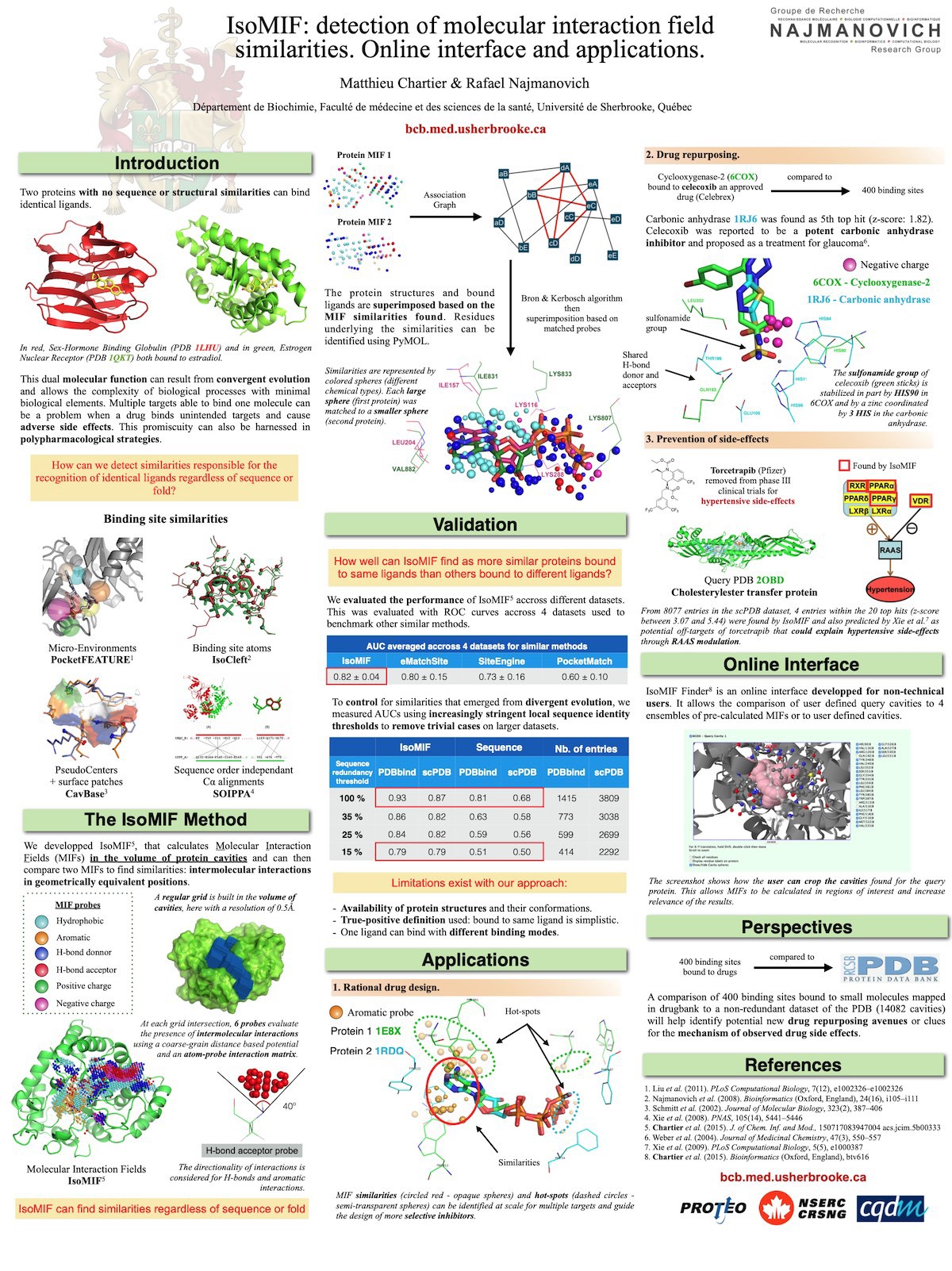
Poster highlights:
- The use of figures and visuals helps to explain the method developed.
- Paragraphs are short and highlight key information.
- The poster isn’t divided into the classic scientific poster sections (let that creativity through!). Instead, because it’s describing a newly developed method, it’s divided into an introduction, method, validation, and applications.
Pieces to improve:
- There are a lot of different colors used. This makes it hard to identify the different sections and the structure of the poster at a glance. Converting the figures and fonts to a more uniform color scheme could help with the visual appeal to people walking by.
- The use of white space could be better (it feels a bit cramped). It would be better to leave some text out and simply mention that information when speaking with visitors during the poster session.
POSTER TWO - An Effective Contrast
Made with: Powerpoint (and figures with BioRender)
Shared by: Simon Fournier (Business Development, CQDM)
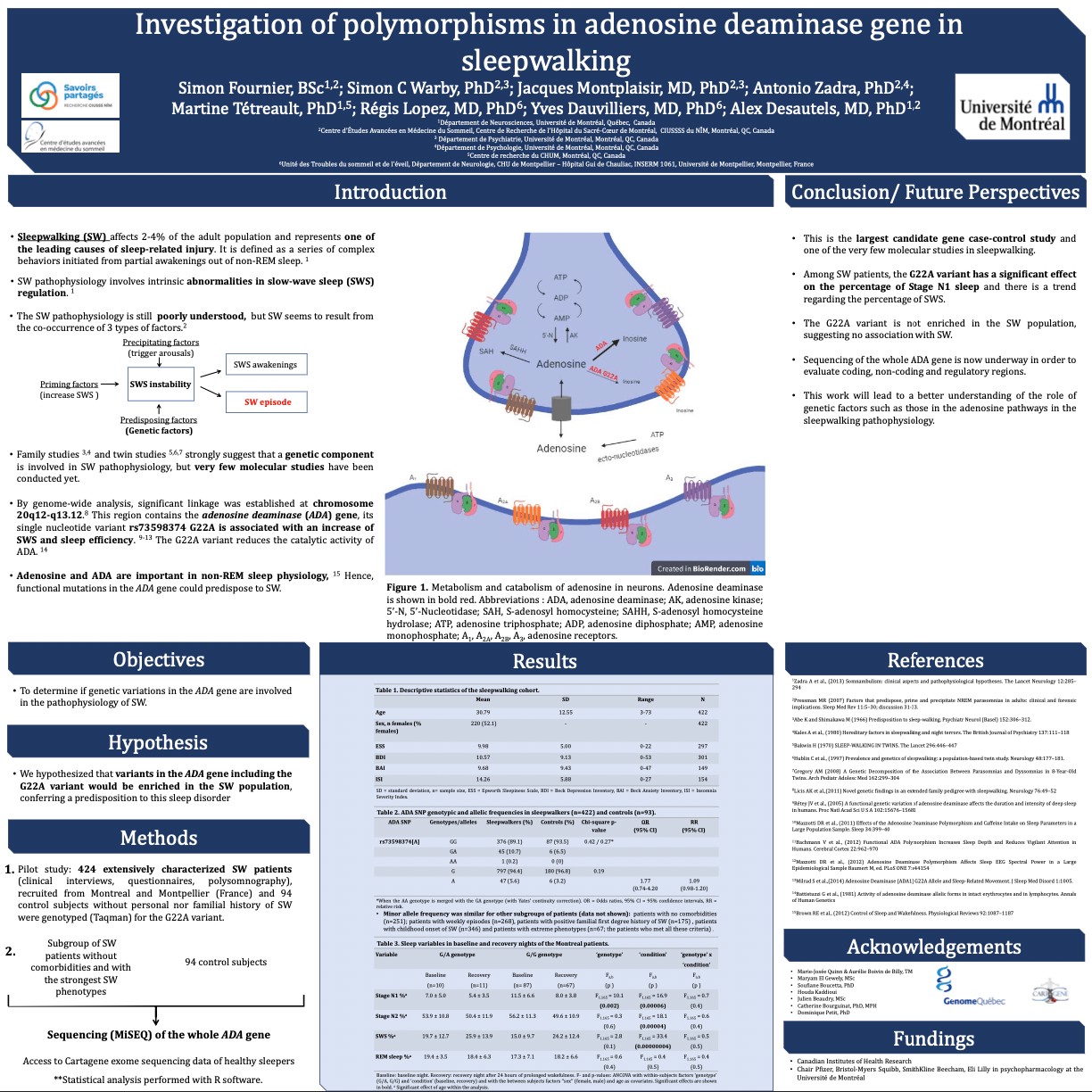
Poster highlights:
- The poster contains clear sections with headings that have good contrasting colors to draw the eye (dark blue on white).
- The figure generated with Biorender is clear and is a good support material to use during the actual poster presentation.
- The use of bullet points helps distinguish the key messages.
Pieces to improve:
- The title of the poster could be a bit more punchy to attract attention.
- Figures could be incorporated more to illustrate the data and draw the eye to the poster.
POSTER THREE - Colorful
Made with: Inkscape
Shared by: Vincent Nault (CEO, Lumed)
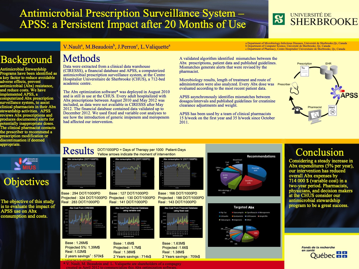
Poster highlights:
- The use of figures helps to illustrate the data and break up the paragraphs.
- A good amount of information is delivered with a relatively small amount of text.
Pieces to improve:
- The combination of colors is distracting at times. It’s not a complementary palette.
- The font sizes seem to vary widely and the bright yellow font is difficult to read.
- Sections don’t flow in a continuous logical order (gives the sensation of jumping around a bit when you’re trying to find the next section).
POSTER FOUR - Beauty in Simplicity
Made with: Adobe Illustrator (contains 3D rendered images created in Autodesk Maya).
Shared by: Mouhanad Babi (PhD, Microscopist and Scientific Illustrator)
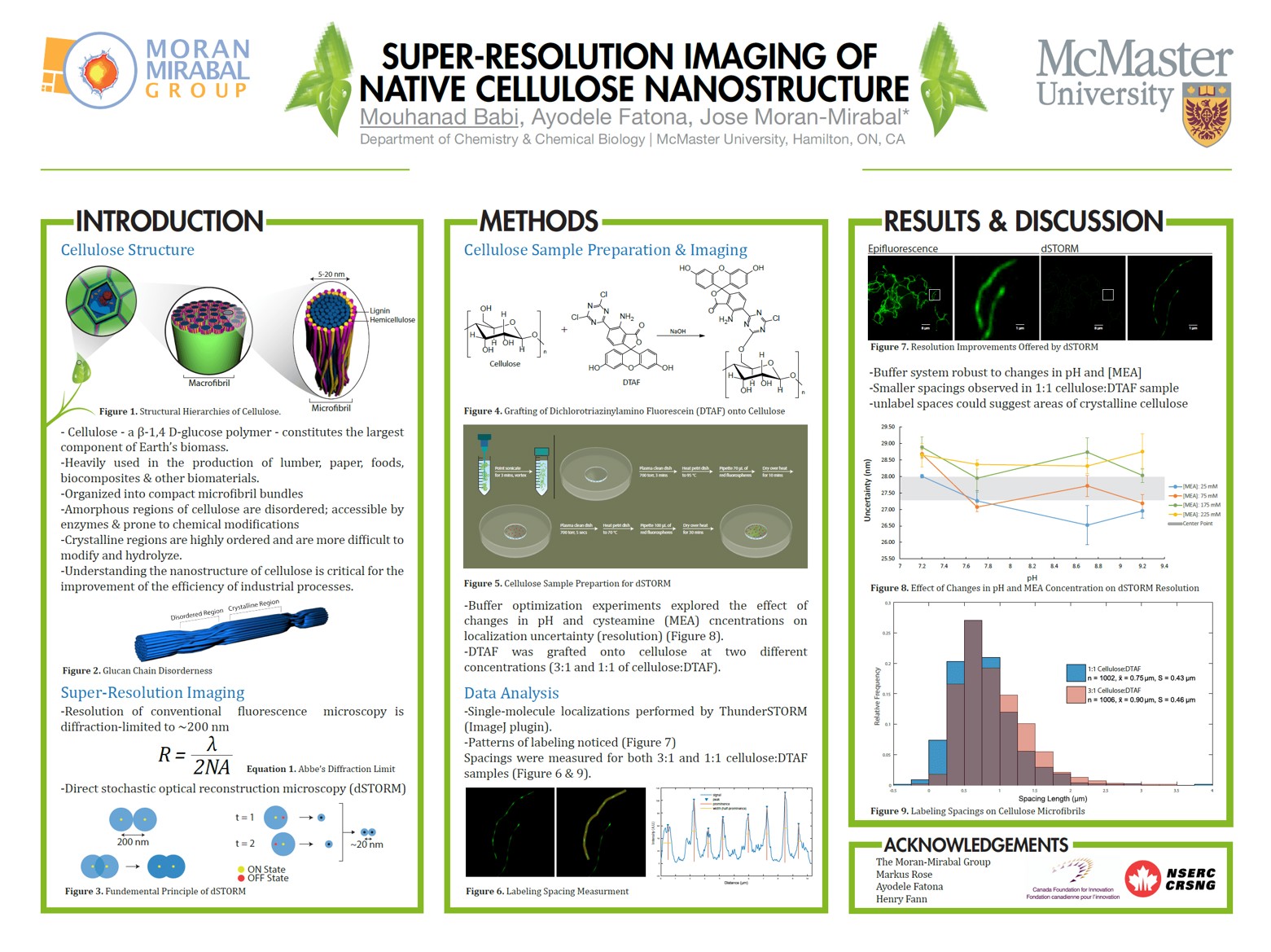
Poster highlights:
- The best thing about this poster is its simplicity. It only has 3 main sections.
- It’s not cramped with text and data and has a lot of white space.
- Easily read and understood in a short period of time.
- Bullet points are used well to share key information.
Pieces to improve:
- The title could be a tad bit catchier.
- There is no contact information if someone wanted to reach out to the presenter.
FUN FACT: This poster was presented at the Biophysical Society of Canada in Montreal in 2017 and won the best poster prize 🏆!
POSTER FIVE - Room to Breathe
Made with: PowerPoint
Shared by: Maxime Descoteaux (CSO at Imeka, Research chair in neuroinformatics)
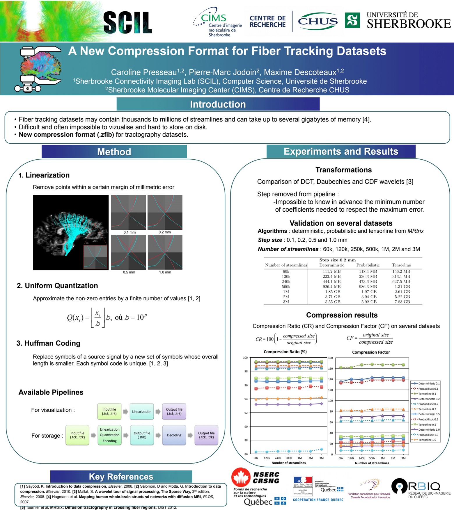
Poster highlights:
- This poster really breathes! It’s mostly white with only darker colors used to clearly delineate the different sections.
- The content is straight to the point. It highlights the problems with existing compression formats then goes straight into the developed method and results.
Pieces to improve:
- A short sentence to summarize the key conclusions would be helpful. However, leaving it out could also encourage the reader to ask the presenter and spark a conversation!
POSTER SIX - Curiosity and QR Codes
Made with: PowerPoint
Shared by: Natália Teruel (from the Najmanovich Research Group)
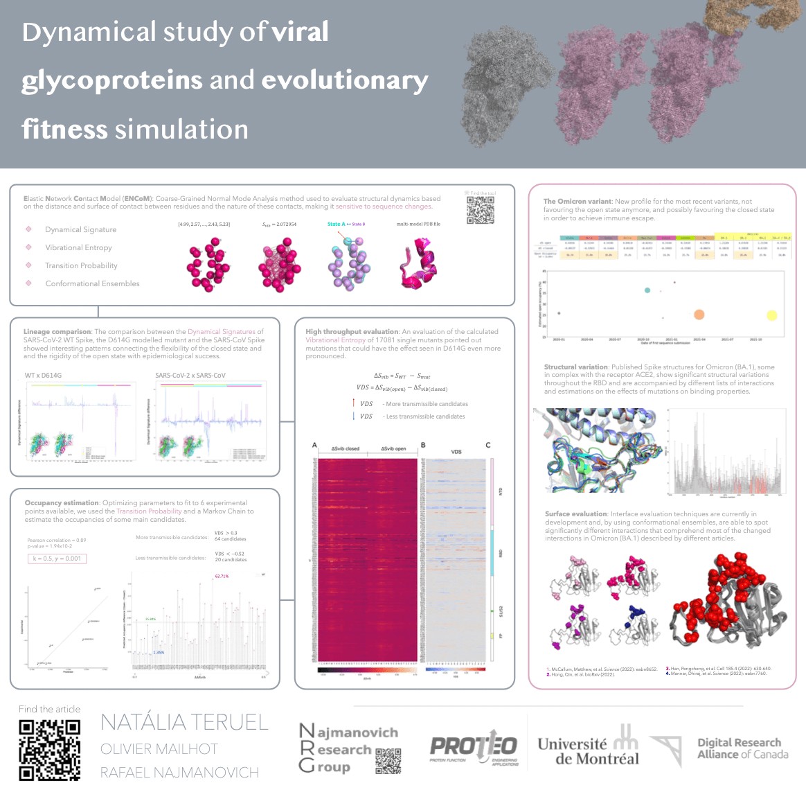
Poster highlights:
- The presenter used small lines to link each bordered section. This guides the viewer well from one section to the next.
- The quality of the figures is high and gives a good first impression.
- The use of QR codes with a small label is a handy way to get people to dive deeper.
Pieces to improve:
- A larger font-size or unique section header style would help make the structure clearer.
- The font color is far too light. It’s hard to read.
Conclusion: Making a great scientific poster
You’ve read the advice. You’ve reviewed the examples. You’ve heard what NOT to do.
What’s next?
As daunting as the task may seem, creating a scientific poster can be a lot of fun. It’s extremely rewarding to set up on the day of the poster session and see your work summarized and displayed in one big, visually appealing package.
So, plan your content carefully, choose a template that works for you, experiment with design elements, and present your research in a clear and visually appealing way. And, as always, don’t be afraid to get creative as you work toward your finished poster!
Acknowledgements
I'd like to thanks all those who contributed some tips and poster examples: Maxime Descoteaux, Natália Teruel, Rafael Najmanovich, Mouhanad Babi, Vincent Nault and Simon Fournier.


